Inspired by the dry weather of the last couple of months in the Neterlands, the overhaul of the gganimate package and examples like on this blog: https://adventuresindata.blogspot.com/2018/10/animated-river-flow-revisited.html i wanted to see how low the water levels really are. And ofcourse to animate the visuals!
Data of water levels in the Netherlands are available through: https://waterinfo.rws.nl/#!/nav/index/ (in dutch)
loading packages:
# devtools::install_github('thomasp85/gganimate')
# devtools::install_github("thomasp85/transformr")
library(tidyverse)
library(janitor)
library(lubridate)
library(gganimate)
I manually gathered some metadata of the measuring stations:
pointinfo <- data.frame(station = c("Dordrecht", "Hoek van Holland",
                                    "Lobith",	"Nijmegen haven",
                                    "Tiel Waal",	"Vlaardingen",	"Vuren"),
                        km = c(53,	2,	165,	141,	114,	21,	79),
                        river = c( "beneden merwede", "nieuwe waterweg",
                                   "rijn",	"waal",	"waal",	"nieuwe maas",	"waal"))
Then its reading and preparing the data for the plot. Adding metadata. The measurements are aggregated to weekly avarages.
## cm in reference to N.A.P. week avarages
df_waterlevels <- read.csv2("wl.csv", stringsAsFactors = F) %>%
  clean_names() %>%
  mutate(dy = as.Date(waarnemingdatum, "%d-%m-%Y"),
         weeknr = week(dy),
         yr = year(dy),
         ## replace 999999999 with NA.
         waterlevel = replace(numeriekewaarde, which(numeriekewaarde == 999999999), NA)) %>%
  rename(station = meetpunt_identificatie) %>%
  filter(!is.na(station)) %>%
  select(waterlevel, station, yr, weeknr) %>%
  group_by(yr, weeknr, station) %>%
  summarise(waterlevel_weekmean = mean(waterlevel, na.rm = TRUE)) %>%
  left_join(pointinfo, by = "station")
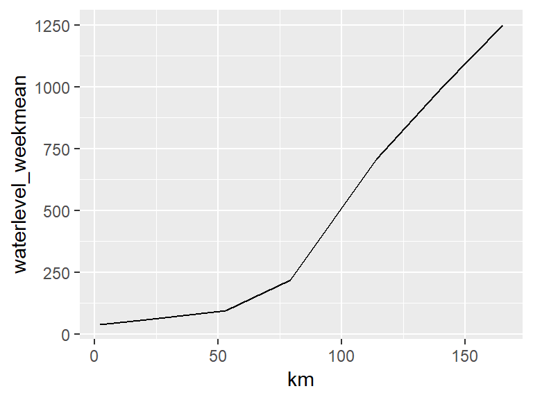
When we plot the data for the first week in 2018 we see that the avarage water level differs more then 1200 centimeter (or 12 meters) over ~160 kilometer. Between the mouth of the river near the sea (at 0 kilometer) and where the river enters the Netherlands.
df_waterlevels %>%
  filter(yr == 2018, weeknr == 1) %>%
  ggplot()+
  geom_line(aes(x = km, y = waterlevel_weekmean))
To get a more meaningful and clearer look at the lower water levels of 2018, lets see the difference with the weekly averages of 2017 over the course of the year. First adding the difference of weekly averages between the years to the data. Then Selecting only the weekly averages for 2018.
df_waterlevels <- df_waterlevels %>%
  filter(yr == 2017) %>%
  group_by(station, weeknr) %>%
  summarise(waterlevel_wk2017mean = mean(waterlevel_weekmean, na.rm = TRUE)) %>%
  right_join(df_waterlevels, by = c("station", "weeknr")) %>%
  mutate(waterlevel_diff = waterlevel_weekmean - waterlevel_wk2017mean) %>%
  ## filter missings in weekly difference
  filter(!is.na(waterlevel_diff))

df_waterlevels_2018 <- df_waterlevels %>%
  filter(yr == 2018)
Then animate with the new gganimate syntax:
a <- ggplot() +
  geom_line(data = df_waterlevels_2018, aes(x = km, y = 0), col = "orangered") +
  geom_line(data = df_waterlevels_2018, aes(x = km, y = waterlevel_diff), col = "cyan3", size = 2) +
  geom_label(aes(x = 2, y = 140, label = "difference in weekly avarage waterlevel of 2018"),
             size = 6, color = "white", fill = " cyan3", fontface = "bold", hjust = "left") +
  geom_label(aes(x = 2, y = 120, label = "compared to the weekly avarage waterlevel of 2017"),
             size = 6, color = "white", fill = " cyan3", fontface = "bold", hjust = "left") +
  geom_label(aes(x = 2, y = 100, label = "weekly avarage waterlevel of 2017 is zero"),
             size = 5, color = "white", fill = " orangered", fontface = "bold", hjust = "left") +
  theme_minimal() +
  scale_x_continuous(breaks = pointinfo$km,
                     minor_breaks = NULL,
                     labels = pointinfo$station) +
  theme(axis.text.x = element_text(face = "bold", size = 14, angle = 340)) +
  ## gganimate options
  labs(title = "weeknumber: {closest_state} - 2018",
       x = "measurepoint",
       y = "") +
  transition_states(weeknr, transition_length = 4, state_length = 0.5) +
  ease_aes("sine-in-out")

## with the explicite animate call there are more animation options available
animate(a, nframes = 400, width = 800, height = 600)
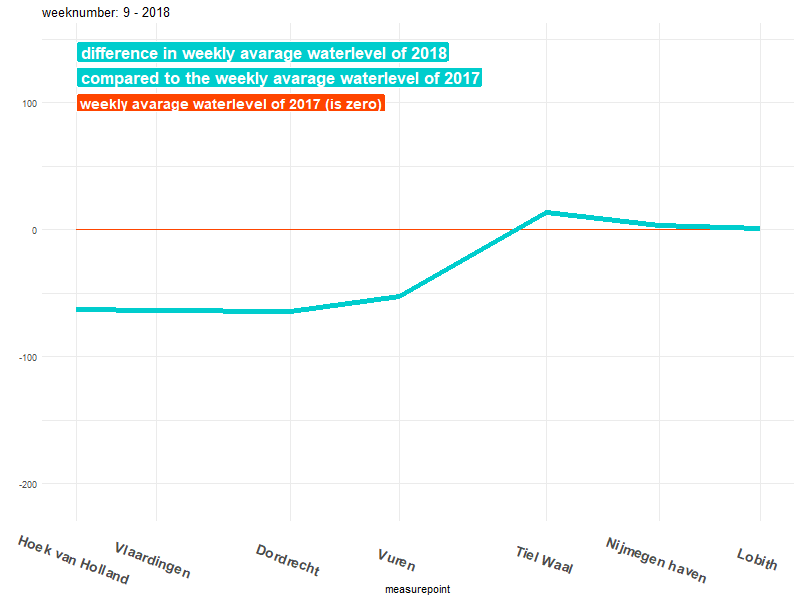
Now we can see that from week ~30 and later the water level drops clearly below the red line. This means that the average water level in those weeks in 2018 are significantly lower than in the same weeks in 2017. The difference is even around 200 cm (2 meters) for the stations near Lobith, Nijmegen and Tiel!
Making animations with the new syntax is a lot easier than before. A lot of the manual data manipulation is now integrated within the functions of the package. Plus its easy to add the animation directly to a plot.
I will probably make more posts about animations in R with gganimate in the future. There are some (almost) finished projects I made with earlier versions of gganimate I still hope to write about =).